
Color is at the heart of expressive and joyful interior design. A thoughtfully curated palette enlivens a room, transforming a space from a blank canvas into an inviting and inspiring place to be. When you’re faced with endless options for paint colors, fabrics, and other materials, building a cohesive palette can feel overwhelming—but going in with a plan can transform it into a rewarding creative exercise! There are lots of ways to approach color selection, but there’s one we use often at Tailored Home, particularly when we’re designing neighboring rooms. Here’s the guiding principle:
Explore tonality within each room, then build complementary color narratives across adjoining rooms.

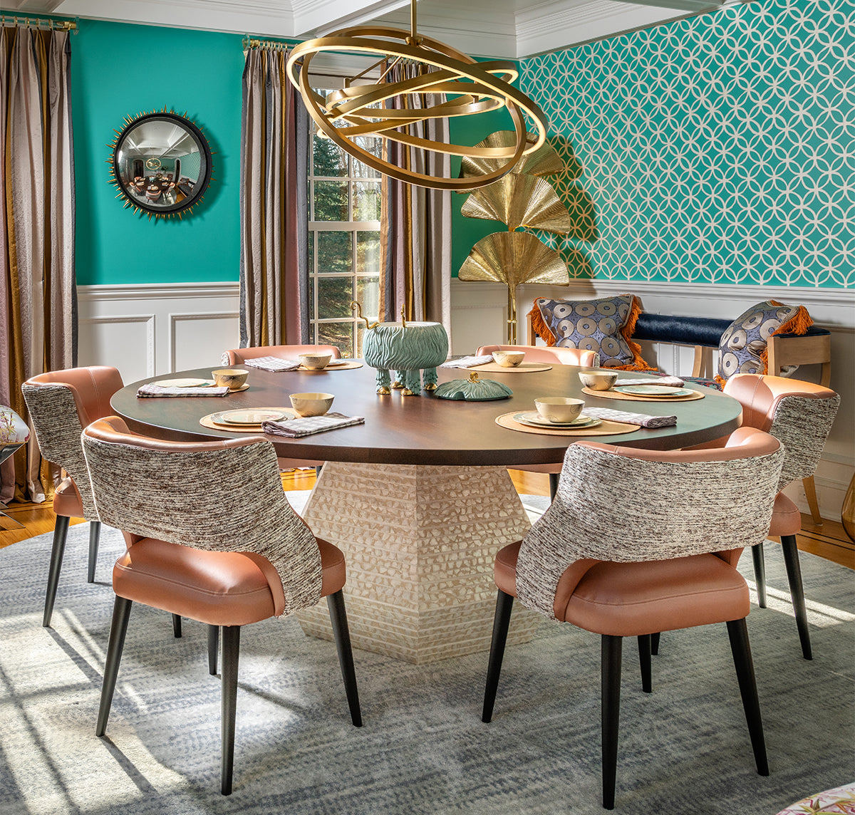
We recently put together a color strategy for an adjoining breakfast room and den using this method, and we captured mood boards along the way to show how it works.
Begin with Wall Color: If you’re starting a palette from scratch, wall color is a great anchor point. In the den, we went for a statement hue (Preference Red), while the breakfast room began with a warm, welcoming neutral (Cat’s Paw). If you're having trouble narrowing down your options, look to your favorite colors from the natural world for inspiration.
Add Tonal Trim: Here’s where tonality comes into play. Once you’ve chosen your wall color, iterate upon it with lighter and darker tones in the same family. For the den, we selected a pale red for the ceiling and dramatic dark red for the trim. We rounded out the breakfast room with a light, neutral ceiling and yellow trim, then added a pop of slate blue for the built-in cabinetry.
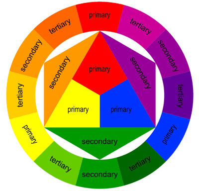
Consider Complementary Colors: Now that you’ve solidified the palettes for your adjoining rooms, it’s time to see if they work together. For that, we like to pull out a classic tool from high school art class: the color wheel. Complementary colors aren’t an exact science, but in general you want to look “across the wheel” to find the most impactful combinations. For example, blues and greens are complementary to oranges and reds, while purples are complementary to yellows.
Layer with Texture & Pattern: If you’re happy with the interplay of your color palettes, you can now select the rest of your materials. Focus on adding a variety of textures and patterns while staying within the palette you selected for each room. In the den, we leaned into an upholstery color scheme of golds, camels, and fawns, with a red-based tartan and striped fringe for a finishing flourish. For the breakfast room, we echoed the blue of the built-ins with sheer window treatments, then selected contrasting leather and wool upholstery in sophisticated neutrals that pick up the wall color.
If you have a room (or two adjoining rooms) that are ready for a new look, let’s connect and try out this method together! With thousands of paint, wallcovering, and fabric options in our Materials Library, we’ll find your perfect palette. Book a consultation to get started.